
Choosing art for an office is easier when you start with the room itself. A reception area, conference room, hallway and private office all serve different purposes. The artwork should support that purpose.
The right painting can make a lobby feel more welcoming, a meeting room feel more polished and a shared workspace feel less cold.
Start with the Purpose of the Space
Before choosing a painting, ask one simple question: what should this space feel like?
A lobby may need to feel professional and memorable. A conference room may need to feel calm and focused. A lounge can feel warmer and more relaxed. A hallway may simply need rhythm, movement and visual interest.
This is why office art should not be chosen the same way for every wall. The size, colors and style should match the way people actually use the room.
Reception Areas and Office Lobbies
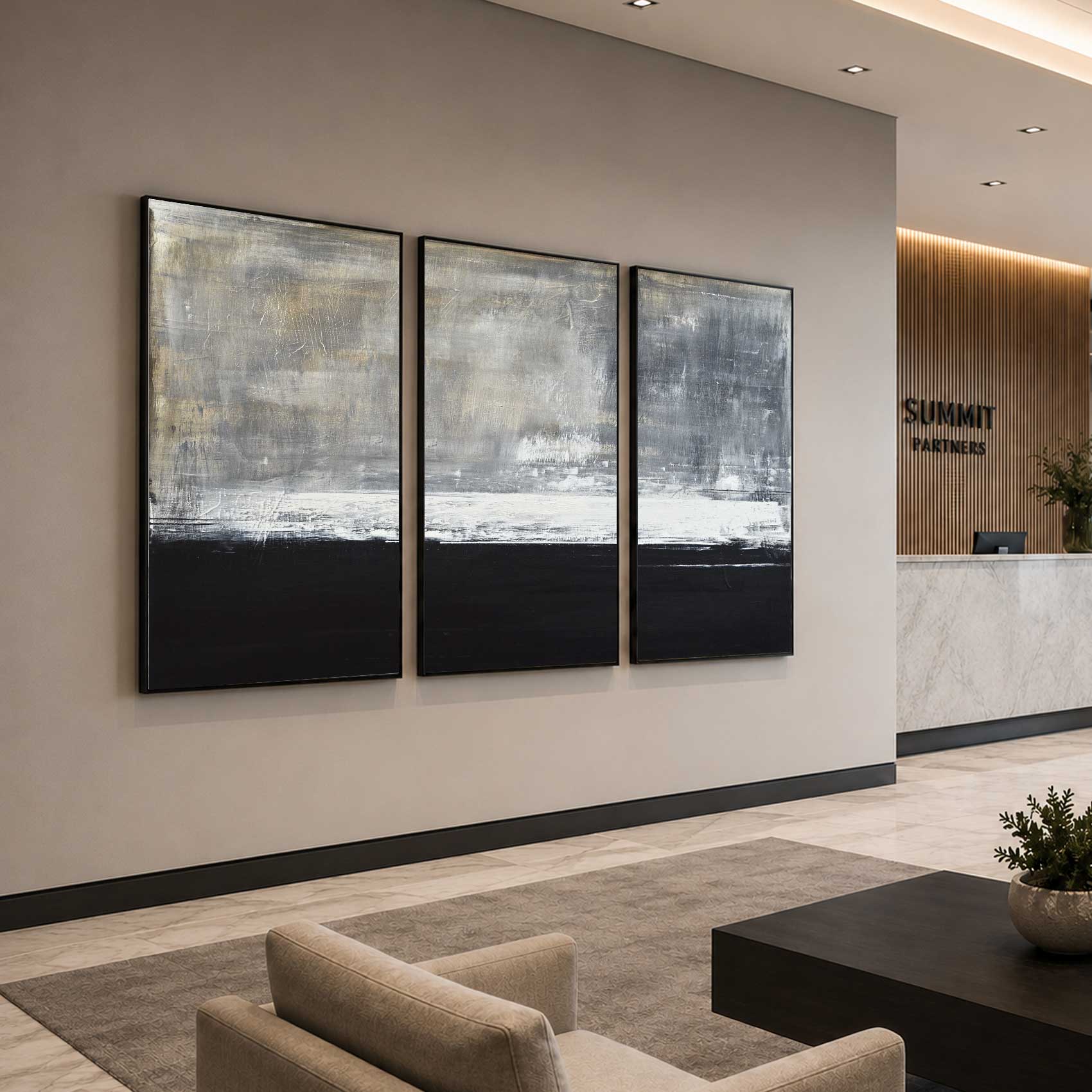
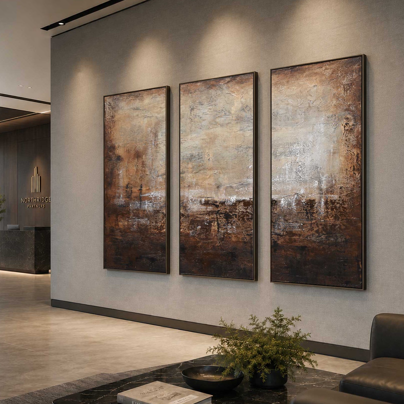
The lobby is one of the best places to invest in office art.
It is often the first thing clients, visitors, vendors and future employees see when they walk in. A blank wall can make the space feel unfinished. A strong painting can make the business feel more established.
For reception areas, larger artwork usually works best. A single large abstract painting behind the front desk can create a clear focal point. If the wall is very wide, a horizontal painting, diptych or triptych can help fill the space naturally.
Choose artwork that feels confident but not overwhelming. Soft neutrals, black and white, deep blue, warm beige, earth tones and refined abstract paintings are all good options for a professional lobby.
The art does not need to match your logo exactly. It usually looks better when it supports the overall feeling of the brand rather than copying the brand colors too literally.
title: "High and Low"
Conference Rooms and Meeting Spaces
Conference rooms need artwork that looks polished without being distracting.
These are spaces where people meet, present ideas, review projects and make decisions. The art should add interest, but it should not compete with the meeting itself.
Abstract paintings work well in conference rooms because they bring color, texture and movement without forcing one subject into the space. Avoid art that feels too loud, too personal or too busy.
The best placement is usually the main wall people see when entering the room, or the wall behind the person who leads meetings. If the room is used for video calls, a well-placed painting can make the room look more professional on camera.
For a large conference room or boardroom, one oversized painting can feel impressive and clean. For a smaller meeting room, a medium horizontal painting may be enough.
Executive Offices
An executive office can handle artwork with more presence.
This space often reflects leadership, taste and company direction. The art can feel more personal than artwork in a hallway or shared workspace.
Large abstract paintings work well behind a desk, above a credenza or on the main wall visitors see when they enter. The piece should feel substantial enough for the room. Small, generic art can make an executive office feel less finished.
Good choices include deep neutrals, black and white, navy, charcoal, warm gray, muted gold and earthy tones. A bolder painting can also work if the room itself is simple.
The key is balance. The art should make the office feel confident, not crowded.
title: "Subtle Distance"
Private Offices
Private offices do not always need dramatic statement art.
Sometimes the best choice is a calm painting that makes the room more comfortable to spend time in. This is especially helpful in offices with screens, paperwork, shelves and storage.
For smaller private offices, choose artwork that fits the wall without overwhelming it. A vertical painting can work beside a bookcase or near a window. A horizontal painting often works nicely above a desk, console or small seating area.
Soft blues, natural tones, muted greens, white, gray and warm neutrals can create a calm working environment.
Open Work Areas
Open work areas are usually more active than private offices.
There may be desks, monitors, chairs, storage, lighting and people moving through the space all day. Artwork in these areas should add energy without adding visual clutter.
Large wall art can help break up long blank walls and make the office feel less plain. Minimal abstract paintings, soft landscape-inspired artwork and balanced modern pieces often work well.
If the office already has a lot of color, choose artwork with a more restrained palette. If the space feels too neutral, art can introduce warmth and personality.
In open areas, it also helps to repeat colors or styles from one wall to another. This creates a consistent look and makes the office feel planned.
title: "South West"
Hallways and Corridors
Hallways are easy to ignore, but they have a big effect on how an office feels.
A long empty hallway can feel cold. Artwork can make it feel more connected to the rest of the office.
For hallways, consider a series of smaller paintings or a few medium-sized pieces spaced evenly along the wall. This creates rhythm as people move through the space.
Horizontal paintings work well in long corridors. Vertical paintings can help fill narrow wall sections between doors or windows.
Avoid anything that sticks out too far in a narrow hallway. Clean framed paintings or stretched canvases usually work best.
Employee Lounges and Break Rooms
Employee lounges, break rooms and casual gathering areas can feel more relaxed than formal office spaces.
This is where employees step away from work, eat, talk or take a short break. The artwork can be warmer, softer or even a little more playful.
A large painting above a sofa, dining table or lounge seating area can make the room feel more complete. If the room is small, one medium-sized piece may be enough.
This is also a good place to use art with gentle color, organic movement or a more cheerful feeling. The goal is to make the room feel human, not corporate.
Waiting Areas and Client Seating
Waiting areas should feel comfortable and considered.
Clients or visitors may only sit there for a few minutes, but the space still shapes their impression. Art can help the area feel less empty and more welcoming.
A painting above a sofa or seating group is often the strongest placement. The size should relate to the furniture below it. If the artwork is too small, it can look disconnected from the room.
Choose artwork that feels calm, refined and easy to enjoy. Avoid pieces that feel too aggressive or visually confusing.
If the waiting area is near the lobby, the artwork should coordinate with the main reception piece. It does not have to match, but it should feel like it belongs in the same office.
title: "Dreaming the Journey"
Choosing the Right Size
Size is one of the most common mistakes in office art.
Many businesses choose artwork that is too small. On a large office wall, small art can look like an afterthought, even if the painting itself is beautiful.
For large walls, choose a large painting, a diptych or a triptych. For tall narrow walls, vertical artwork is often a better fit. For wide walls, horizontal paintings usually feel more natural.
When placing art above furniture, the artwork should feel connected to the width of the furniture below it. It does not need to be exact, but it should not feel tiny.
If you are unsure, it is usually better to go slightly larger rather than too small.
Choosing Colors for Office Art
Color has a major effect on the feeling of a room.
Neutral artwork can make an office feel calm and timeless. Black and white paintings can feel modern and confident. Blue tones often feel clean and professional. Earth tones can make a room feel warmer and more grounded.
Bolder colors can work well in creative offices, lounges or simple modern spaces that need more energy.
Look at the room first. Notice the flooring, furniture, wall color, lighting and any brand colors. Then choose artwork that complements the space.
The art should not disappear into the room, but it should not fight the room either.
Creating a Cohesive Office Art Plan
If you are choosing art for several rooms, think about the office as a whole.
The paintings do not all need to match. In fact, they should not feel too identical. But there should be a connection between them.
You can create consistency through color, style, size, framing or overall mood.
For example, you might choose a stronger statement piece for the lobby, calmer artwork for private offices and a related series of paintings for hallways. This makes the office feel designed instead of decorated one wall at a time.
View Office Collection
Choosing art by space type helps each area of the office feel more complete. The lobby can create a stronger first impression. The conference room can feel more professional. Private offices can feel more comfortable. Hallways and lounges can feel warmer and more inviting.
At Elevate Art Gallery, our office paintings collection includes original handmade artwork selected for reception areas, conference rooms, executive offices, shared workspaces and modern commercial interiors.
View Office Collection to explore paintings that can bring more warmth, presence and personality to your office walls.
FAQs About Choosing Art for Office Walls
What type of art is best for office walls?
Abstract paintings are often a strong choice because they add visual interest without being too specific or distracting. Neutral abstract art, black and white paintings, large modern paintings and calming landscape-inspired pieces can all work well.
How do I choose art for an office lobby?
Choose artwork that creates a strong first impression. Larger paintings usually work best, especially behind a reception desk or above a seating area. The art should feel professional, welcoming and connected to the style of the business.
What size artwork should I choose for an office?
The size depends on the wall and the furniture nearby. Large walls usually need larger paintings, a diptych or a triptych. Above furniture, the artwork should feel visually connected to the width of the piece below it.
Should office art match the company colors?
Office art does not have to match company colors exactly. It often looks better when it complements the brand colors and overall atmosphere of the office. The goal is cohesion, not a perfect match.
Where should artwork be placed in an office?
Good places include reception areas, lobbies, conference rooms, executive offices, hallways, waiting areas and employee lounges. Start with the spaces that clients and employees see most often, then build from there.
Learn More:
Why Office Art Matters for Employee Experience
How to Choose the Right Size Artwork for an Office Wall